

Liquid Glass CSS Generator
Settings
Heads up: The lens effect only renders in Chrome and similar browsers like Edge and Brave. Other browsers like Safari and Firefox don't have the capability yet, so they show a vivid frosted glass without the actual lens. The two sliders below control the lens, so they only have an effect where it's supported (Chromium-based browsers).
Preview
CSS
width: 420px;
height: 280px;
border-radius: 40px;
background: rgba(255, 255, 255, 0.12);
backdrop-filter: blur(1px) url(#lg-filter) blur(2px) saturate(1.5) brightness(1.1);
-webkit-backdrop-filter: blur(8px) saturate(1.8) brightness(1.15) contrast(1.05);
box-shadow:
  inset 0 0 0 1px rgba(255, 255, 255, 0.15),
  inset 1.5px 1.5px 0 rgba(255, 255, 255, 0.5),
  inset 0 0 12px rgba(255, 255, 255, 0.2),
  0 8px 32px rgba(0, 0, 0, 0.2);
SVG
(paste once, anywhere in DOM)<!-- Sized for 420×280px. If your element is a different size, update the four width/height attributes below to match. -->
<svg width="0" height="0" style="position: absolute" aria-hidden="true">
<filter id="lg-filter" x="0" y="0" width="100%" height="100%" color-interpolation-filters="sRGB">
<feImage x="0" y="0" width="420" height="280" href="data:image/svg+xml;utf8,%3Csvg%20xmlns%3D%22http%3A%2F%2Fwww.w3.org%2F2000%2Fsvg%22%20width%3D%22420%22%20height%3D%22280%22%20viewBox%3D%220%200%20420%20280%22%3E%3Cdefs%3E%3ClinearGradient%20id%3D%22Y%22%20x1%3D%220%22%20x2%3D%220%22%20y1%3D%223%25%22%20y2%3D%2297%25%22%3E%3Cstop%20offset%3D%220%25%22%20stop-color%3D%22%230F0%22%2F%3E%3Cstop%20offset%3D%22100%25%22%20stop-color%3D%22%23000%22%2F%3E%3C%2FlinearGradient%3E%3ClinearGradient%20id%3D%22X%22%20x1%3D%222%25%22%20x2%3D%2298%25%22%20y1%3D%220%22%20y2%3D%220%22%3E%3Cstop%20offset%3D%220%25%22%20stop-color%3D%22%23F00%22%2F%3E%3Cstop%20offset%3D%22100%25%22%20stop-color%3D%22%23000%22%2F%3E%3C%2FlinearGradient%3E%3C%2Fdefs%3E%3Crect%20width%3D%22420%22%20height%3D%22280%22%20fill%3D%22%23808080%22%2F%3E%3Cg%20filter%3D%22blur(2px)%22%3E%3Crect%20width%3D%22420%22%20height%3D%22280%22%20fill%3D%22%23000080%22%2F%3E%3Crect%20width%3D%22420%22%20height%3D%22280%22%20fill%3D%22url(%23Y)%22%20style%3D%22mix-blend-mode%3Ascreen%22%2F%3E%3Crect%20width%3D%22420%22%20height%3D%22280%22%20fill%3D%22url(%23X)%22%20style%3D%22mix-blend-mode%3Ascreen%22%2F%3E%3Crect%20x%3D%2214%22%20y%3D%2214%22%20width%3D%22392%22%20height%3D%22252%22%20rx%3D%2226%22%20ry%3D%2226%22%20fill%3D%22%23808080%22%20filter%3D%22blur(14px)%22%2F%3E%3C%2Fg%3E%3C%2Fsvg%3E" result="displacementMap" />
<feDisplacementMap in="SourceGraphic" in2="displacementMap" scale="144" xChannelSelector="R" yChannelSelector="G" />
<feColorMatrix type="matrix" result="displacedR" values="1 0 0 0 0 0 0 0 0 0 0 0 0 0 0 0 0 0 1 0" />
<feDisplacementMap in="SourceGraphic" in2="displacementMap" scale="142" xChannelSelector="R" yChannelSelector="G" />
<feColorMatrix type="matrix" result="displacedG" values="0 0 0 0 0 0 1 0 0 0 0 0 0 0 0 0 0 0 1 0" />
<feDisplacementMap in="SourceGraphic" in2="displacementMap" scale="140" xChannelSelector="R" yChannelSelector="G" />
<feColorMatrix type="matrix" result="displacedB" values="0 0 0 0 0 0 0 0 0 0 0 0 1 0 0 0 0 0 1 0" />
<feBlend in="displacedR" in2="displacedG" mode="screen" result="rg" />
<feBlend in="rg" in2="displacedB" mode="screen" />
</filter>
</svg>Understand
What is Liquid Glass ?
Liquid Glass is the next chapter after glassmorphism: instead of a flat blurred panel, the surface refracts and bends light from whatever is behind it. The hallmark is a soft, watery distortion at the edges, a faint chromatic shift, and an inset highlight that mimics curved glass — a look popularised by Apple's 2025 OS redesigns.
The effect uses a tiny invisible "lens map" to bend whatever's behind the panel with a hint of color fringing at the edges and a touch of color, contrast, and frost to match Apple's regular variant. It looks best in Chrome and similar browsers like Edge and Brave. Other browsers like Safari and Firefox don't have the capability yet, so they show a vivid frosted glass without the actual lens. Heavier studio-style tools take a different approach for a true refraction.
Tools
More design tools
Tools and content carefully crafted by Hire Digital especially for you
CSS
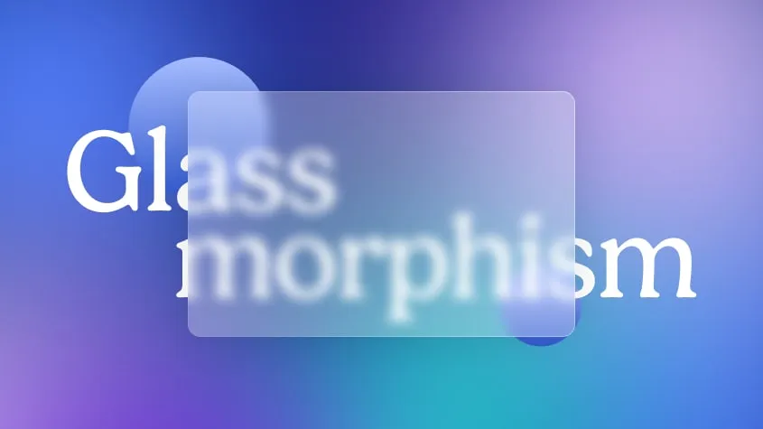
Glassmorphism CSS Generator
Try and generate your own glass effect. Copy and paste the CSS snippet into your frontend to use the effect.
Design
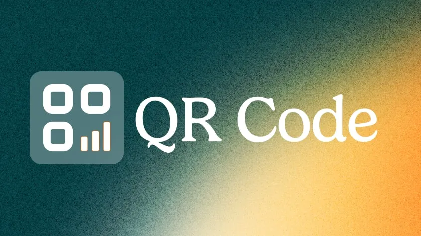
QR Code Generator
Generate clean, scannable SVG QR codes from any URL or text. Add a logo, customize colors, eyes, and module shape, then download as SVG or PNG.
SEO
Rich Results Preview & Schema Validator
Paste JSON-LD or page HTML and see live SERP rich-result previews for Article, Product, FAQ, Recipe, Event, Video, JobPosting, and more — with full Schema.org validation.
SEO
llms.txt Generator
Generate an llms.txt file for your site — the Markdown index that tells ChatGPT, Claude, and Perplexity what your pages are. Crawls your sitemap and builds a clean index from your real page metadata.
Marketing
Image Compressor
Compress and optimize JPG, PNG, and WebP images right in your browser using MozJPEG, libwebp, and OxiPNG. Reduce image file size without losing quality — no upload, no server.
Design
Background Remover
Remove backgrounds from photos using an on-device AI model. Drop in a JPG, PNG, or WebP and get a transparent cutout in seconds. Nothing is uploaded.
Marketing
PDF Compressor
Compress and optimize PDFs in your browser by recompressing embedded images with MozJPEG. Reduce PDF file size for scans, presentations, and image-heavy documents. Files never leave your device.
Marketing
PDF Merger
Merge and combine multiple PDF files into one document, right in your browser. Reorder files before merging — lossless quality, no upload, no signup, no watermarks.