
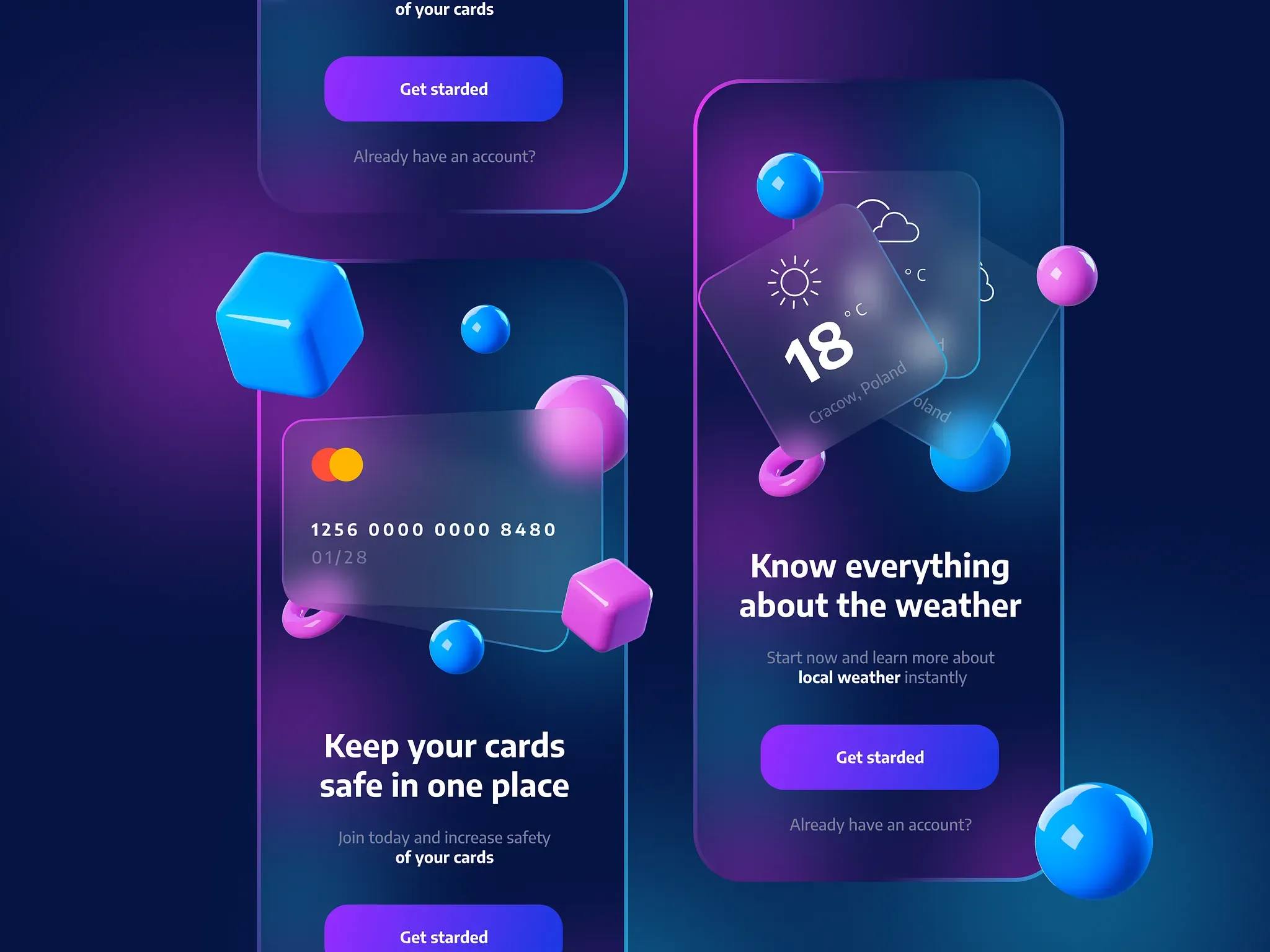
Glassmorphism design is characterized by the use of frosted glass in the UI. It can be used as a layer over the content or as a background. Glassmorphism has become an integral part of design, especially as more designers are incorporating it into their work.
In this article, we’re taking a closer look at the main characteristics of Glassmorphism and how to apply it to your designs.
What is Glassmorphism design?
Glassmorphism is a design style, coined by Michal Malewicz to connect and combine all of the uses of the “frosted glass” effect in the UI. By categorizing it and giving it a common name, it became easier to find and learn about it from resources all around the web.
Glassmorphism is gaining traction because it is simple and clean but still offers enough distinction to create something unique. A lot of times, this style will be seen on websites and apps that offers more information about their products without overwhelming visitors with too much text or imagery, like on a product page.
History
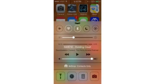
As UI design is always evolving, so is the use of frosted glass effects. We’ve seen it used before in iOS 7 and 8 to create the background of Notification Center widgets, but now it is being used in a whole new way. Some designers are now using this effect to fill large portions of their interfaces with an eye-catching blurred background while keeping all the other elements on top clear and legible.
From Skeuomorphism in the 80s to the fancy 3D look from Claymorphism it has been a long path, but the general idea of an object in software mimics its real-world counterpart. Let’s have a look at the main approach to this concept:
Skeuomorphism:
Skeuomorphism is a word used to describe the design style that mimics real-world objects. Apple was a major proponent of this style, with its original iPhone and Macbook line. Skeuomorphism is often criticized as being outdated, clunky, and for obstructing the user’s view. It also tends to come across as lazy design, as it does not require much creativity.
Claymorphism:
Claymorphism is a design style that incorporates “clay” elements, such as textures and shapes. These “clay” elements are often combined with more traditional UI elements like text and buttons.
Neumorphism:
Another design trend that has been very common lately — neumorphic design. This new style is a blended form of skeuomorphic and flat design.
The goal of neumorphism is not necessarily to create something that is realistic, but rather to explore what it feels like when humans interact with technology and life through a machine or computer. There are numerous ways you can use this style for your own projects, from illustrations and interactive games to website design. Here are some examples of how neumorphism has been used in other successful projects.
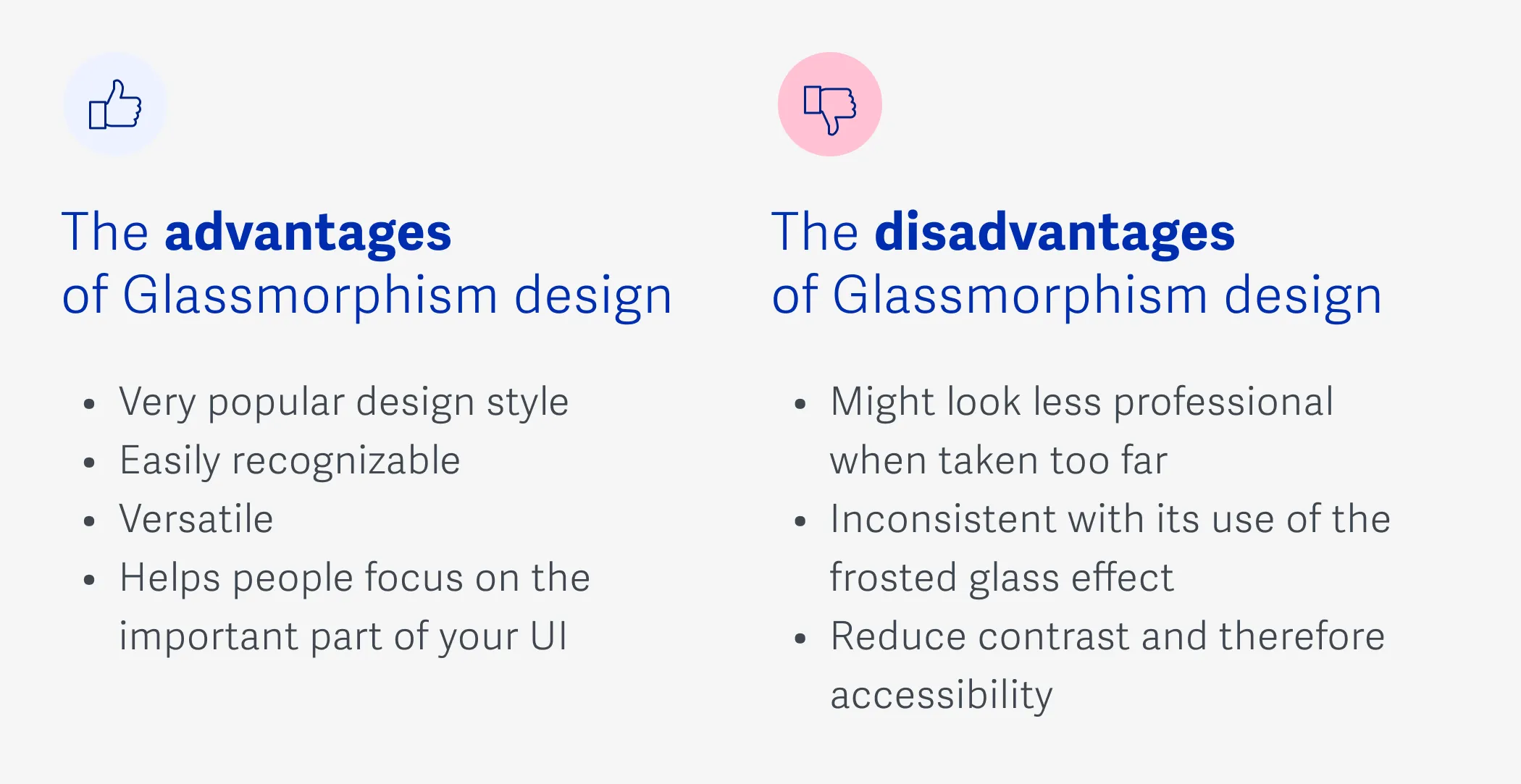
The advantages of the Glassmorphism style
- It is a very popular design style and is easily recognizable.
- Glassmorphism can really help to give your app or website a unique look and feel.
- The glass effect can be used for almost anything you want, from buttons to navigation bars.
- Glassmorphism is a great tool to use when you want to add something interesting to your UI without cluttering it up with too many effects.
- Adding the frosted glass effect to your UI can help people focus on the important part of your UI.
- You will have more control over the color of the frosted glass, which gives you more color options with this design style.
The disadvantages of Glassmorphism design
There are some disadvantages of Glassmorphism. For example, the design can look less professional when it is taken too far. It also has a tendency to be sloppy and inconsistent with its use of the frosted glass effect. “Sloppiness” is something that should be avoided in design, which is why it is important to implement Glassmorphism with care.
Glassmorphism layouts also tend to ship a lot of high-resolution background imagery — which can drag your page speed down if you’re not careful. Pick a modern image format (JPG vs WebP vs AVIF in 2026) and run heroes through an image compressor before publishing.
How do you use Glassmorphism?
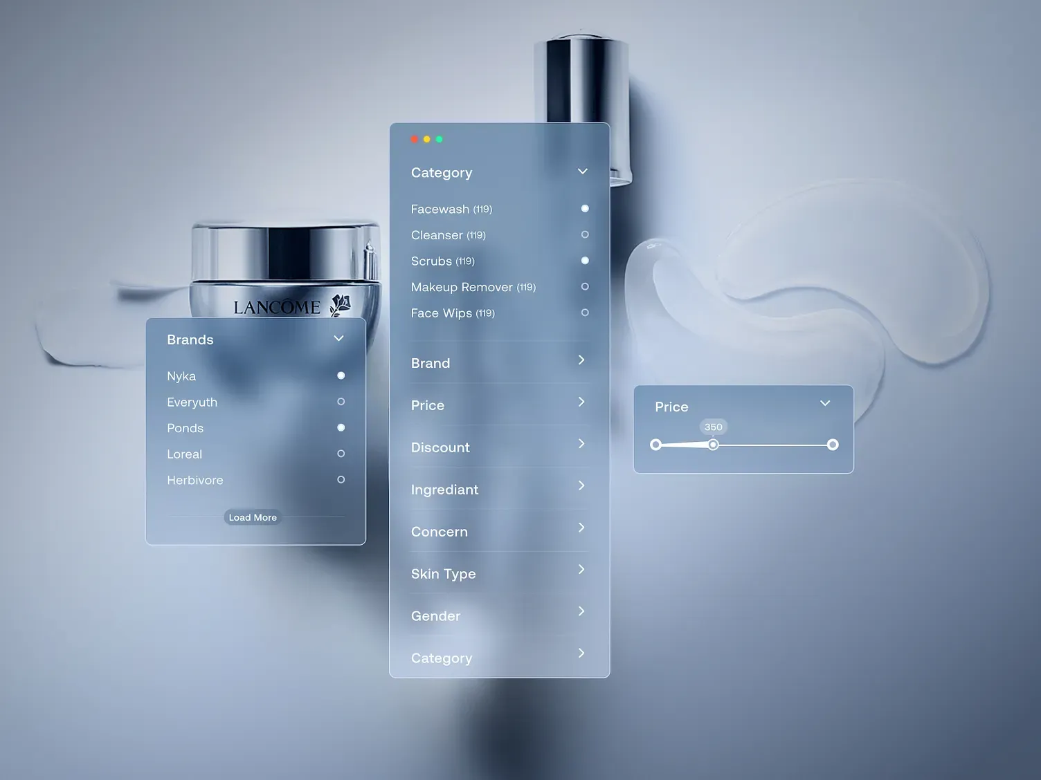
There are many ways to use Glassmorphism in design, but the most common is when you want to obfuscate something that is not meant to be seen by the user. It might be used in UI design as a way of giving context without interruption. It can also be used as a way to indicate that there is more information available, but keep it out of sight so it doesn’t interrupt the current workflow. Here are a few examples of how you might use it:
Backgrounds
Of course you can use Glassmorphism to simply blur what is behind it. But if you combine it with a mask you can create a cool-looking blurred background to use in your design.
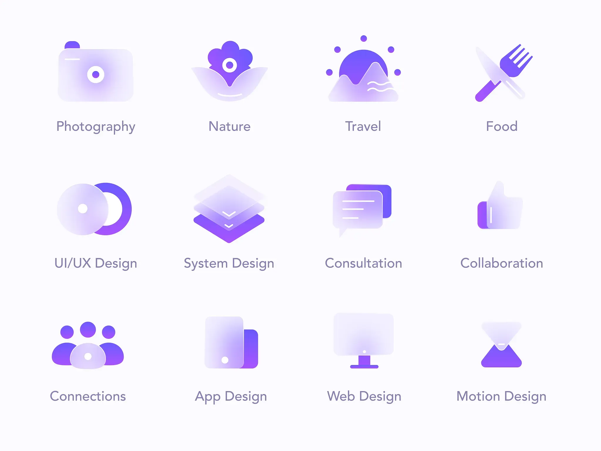
Icons
Tired of flat or 3d icons? Maybe include a touch of glass in your icons to create a more futuristic look.
Multi-layered style
If you have many layers of depth on your interface it could help to add some transparency and background blur to make it look lighter.
3D designs
Mixing the transparency and feeling of depth of the Glassmorphism style with some 3D is a perfect combination to create awesome modern-looking designs.
Which apps use Glassmorphism?
There are many apps that use Glassmorphism in their UI, such as:
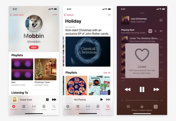
Apple Music
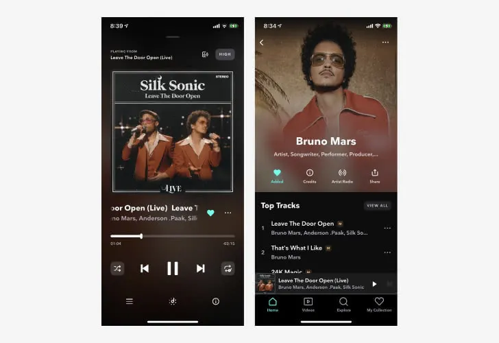
Apple Music uses a bit of Glassmorphism when some information should be perceived as being above other elements. It uses high blur and low transparency to make sure the content is readable.
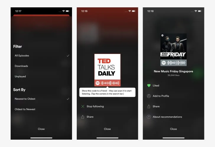
Spotify
Spotify uses an effect similar to glassmorphism when presenting menus, filters, and overlays to reduce the friction on the navigation to complementary information.
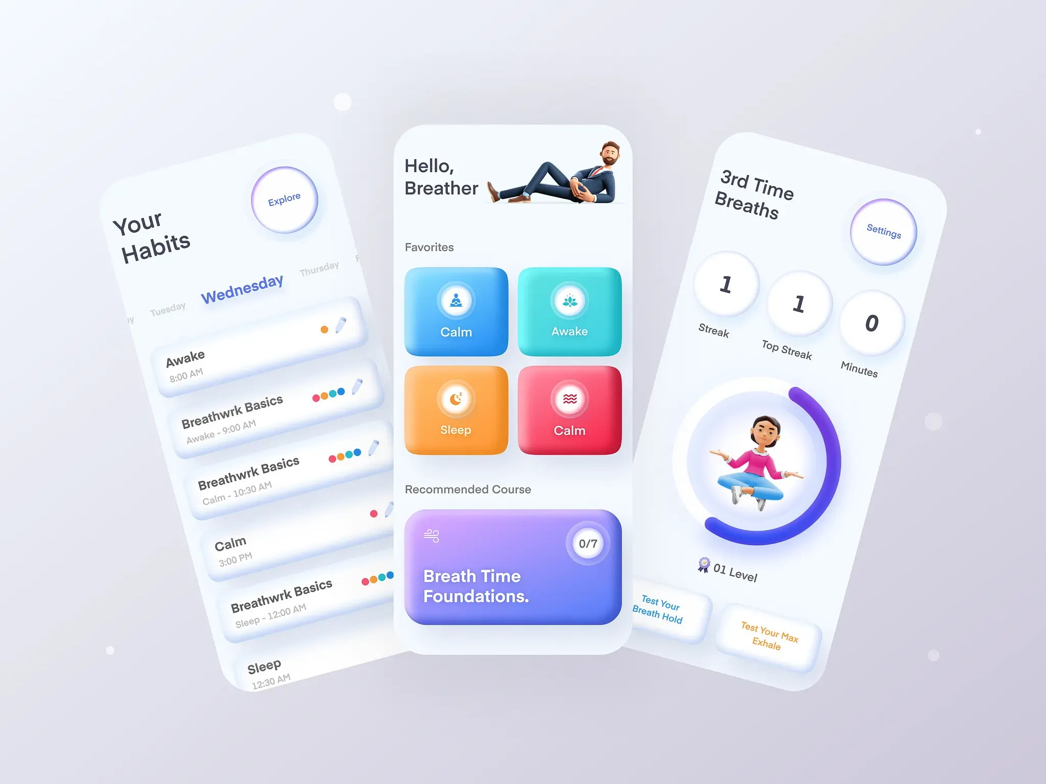
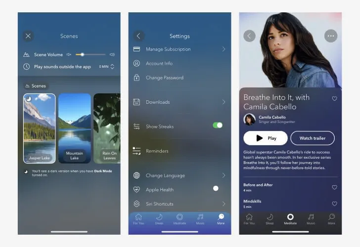
Calm
Calm is a meditation/relaxation app that uses Glassmorphism to create a breathful look and feel.
Beat
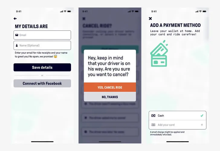
Beat is a ride app with a bold design that uses just some glass effects to make the design look less flat.
Tidal
Following the trend of other music players, Tidal app also uses some touches of glassmorphism when showing the player or additional information.
How do you make Glassmorphism?
A lot of people have a hard time understanding how to implement Glassmorphism in their designs. But if you get the idea of “creating layers of glass” to support your content, it is actually really simple.
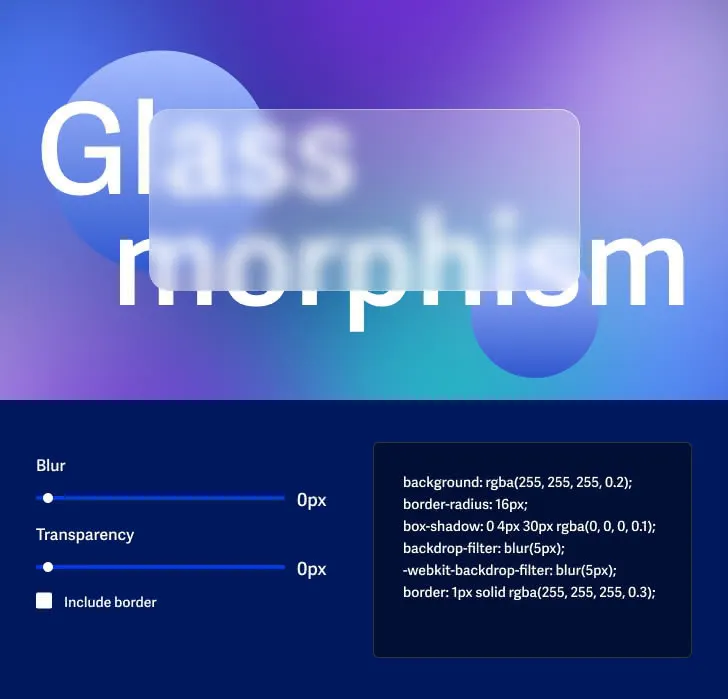
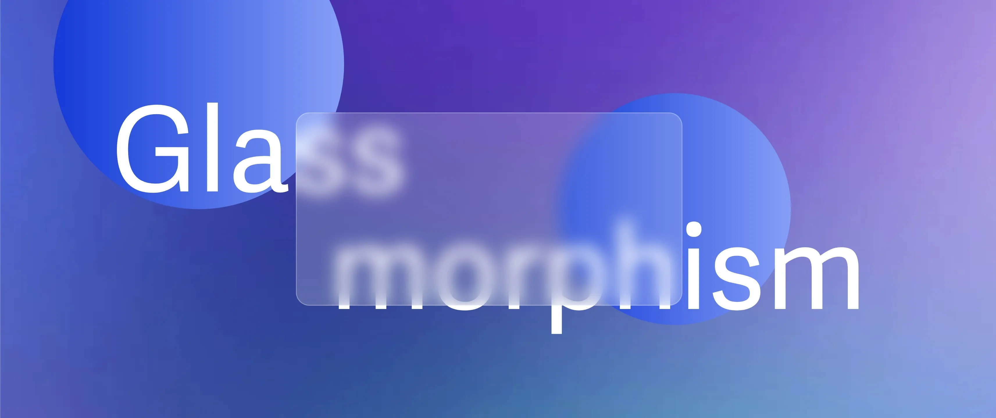
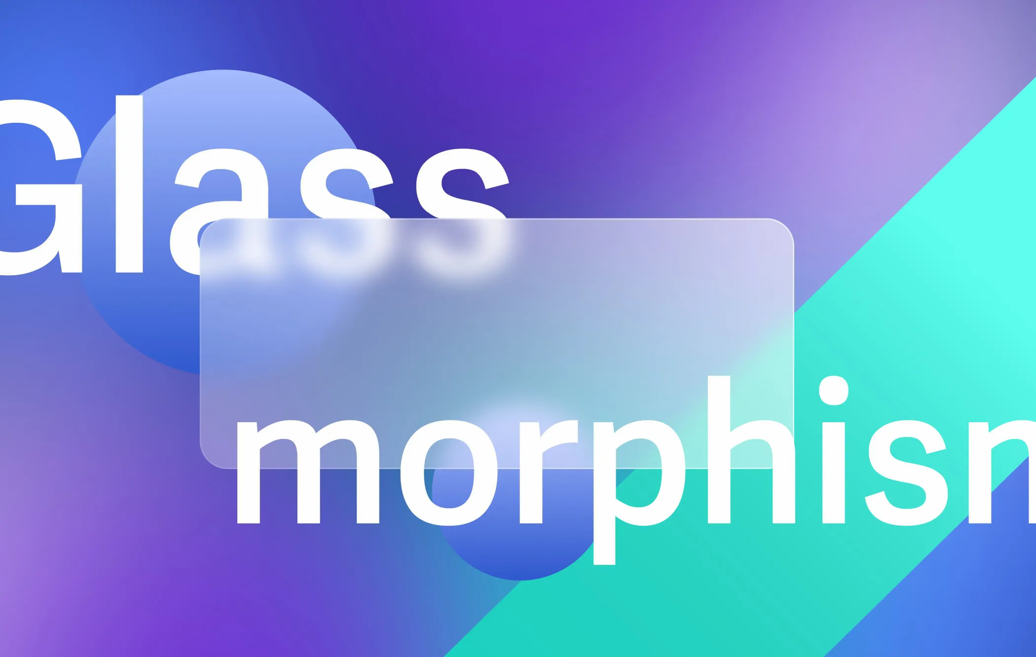
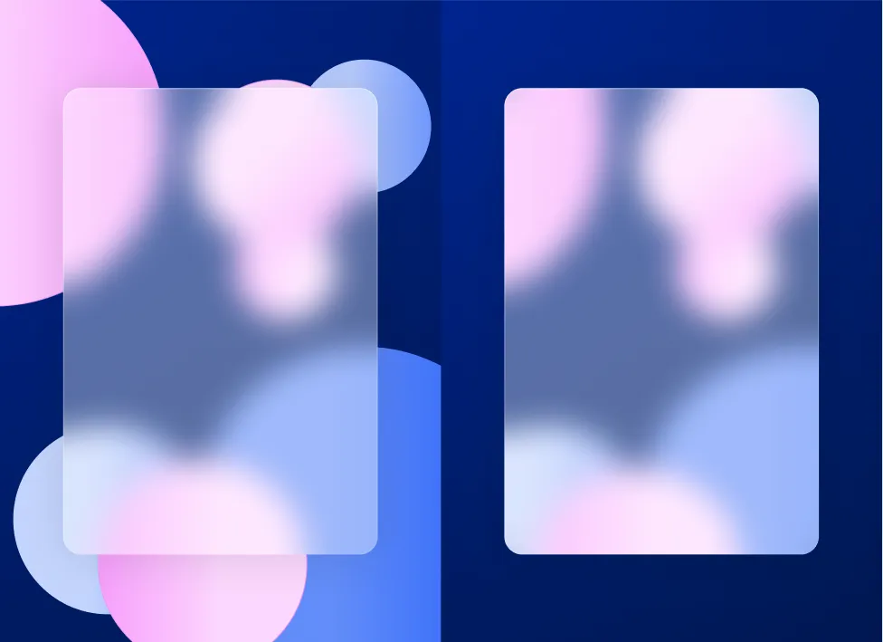
Creating a good Glassmorphism design is all about transparency and blur.
The main idea behind Glassmorphism is to combine two or more different layers of information together into one cohesive design. This can be done by adding transparency to the top layer and adding a blur to what is behind it. The trick is only what is behind the “glass” will be blurred.
We use to do this by duplicating the background, grouping it (if there were multiple elements), blurring it, and then masking it to match the top element. It used to be time-consuming and if you changed the background you had to apply the effect all over again.
But not anymore.
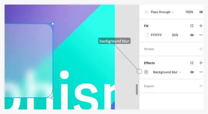
Modern design tools like Figma and Adobe XD now offer an effect called background blur which does all the hard work for you.
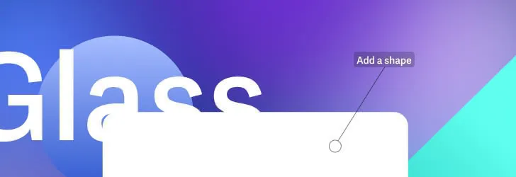
The process to create a glassmorphic element is as simple as:
1. Have a background
We will need something behind our “glass” card to see the effect. So let’s start with it.
2. Create a shape above the background
Usually with rounded corners
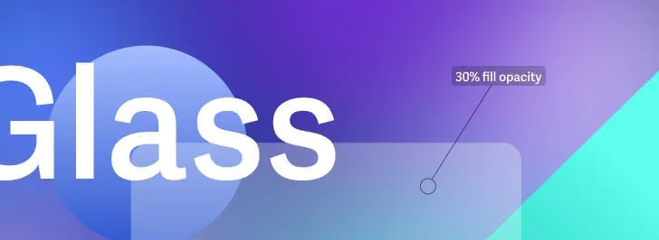
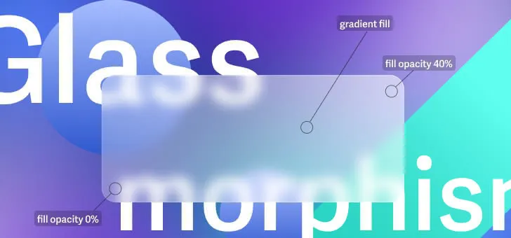
3. Reduce the fill opacity
But not too much as it will become the “color” of your glass
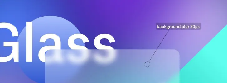
4. Add the background blur
You can already see the Glassmorphism effect starting to appear. But we can add some more details to make it really stand out.
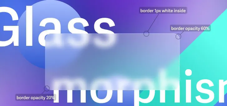
5. Add a border
Set it to inside, and apply a white gradient from 60% to 20%.
6. Add a new gradient fill
Create it above the solid fill, and apply a white gradient (adjusting the opacity until it is subtle.)
7. Add more depth
Move some elements behind it and add shadows to increase the perception of depth on your layout.
How do you create Glassmorphism in Figma?
In Figma you can add the background blur effects by selecting a shape, then click “Effects” on the right sidebar and select the option “Background blur”.
How do you make Glassmorphism in Adobe XD?
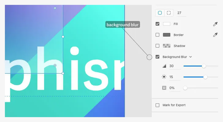
In Adobe XD you can find the blur effect by selecting a shape followed by the Background blur checkbox on the right sidebar. Differently from Figma, Adobe XD allows you to set the brightness and transparency for the effect itself.
Try it live: Glassmorphism CSS generator
The Glassmorphism CSS generator is a free tool we have provided to generate CSS and HTML components.